I’ve been collecting pictures of gallery walls on pinterest for a little while now trying to figure out the look I’m after for my own house. After a ton of furniture re-arrangements (do you do this too??) I’ve finally decided on the one below, with our sofa (and the huge wall behind it) to be the focal point in that area of the house. That wall used to be home to the fireplace (now on the left in the picture below) along with a big ugly flat screen above it. I banished it to what will be the man cave soon enough.
Here’s my blank (and kinda of intimidating) canvas I have to work with:
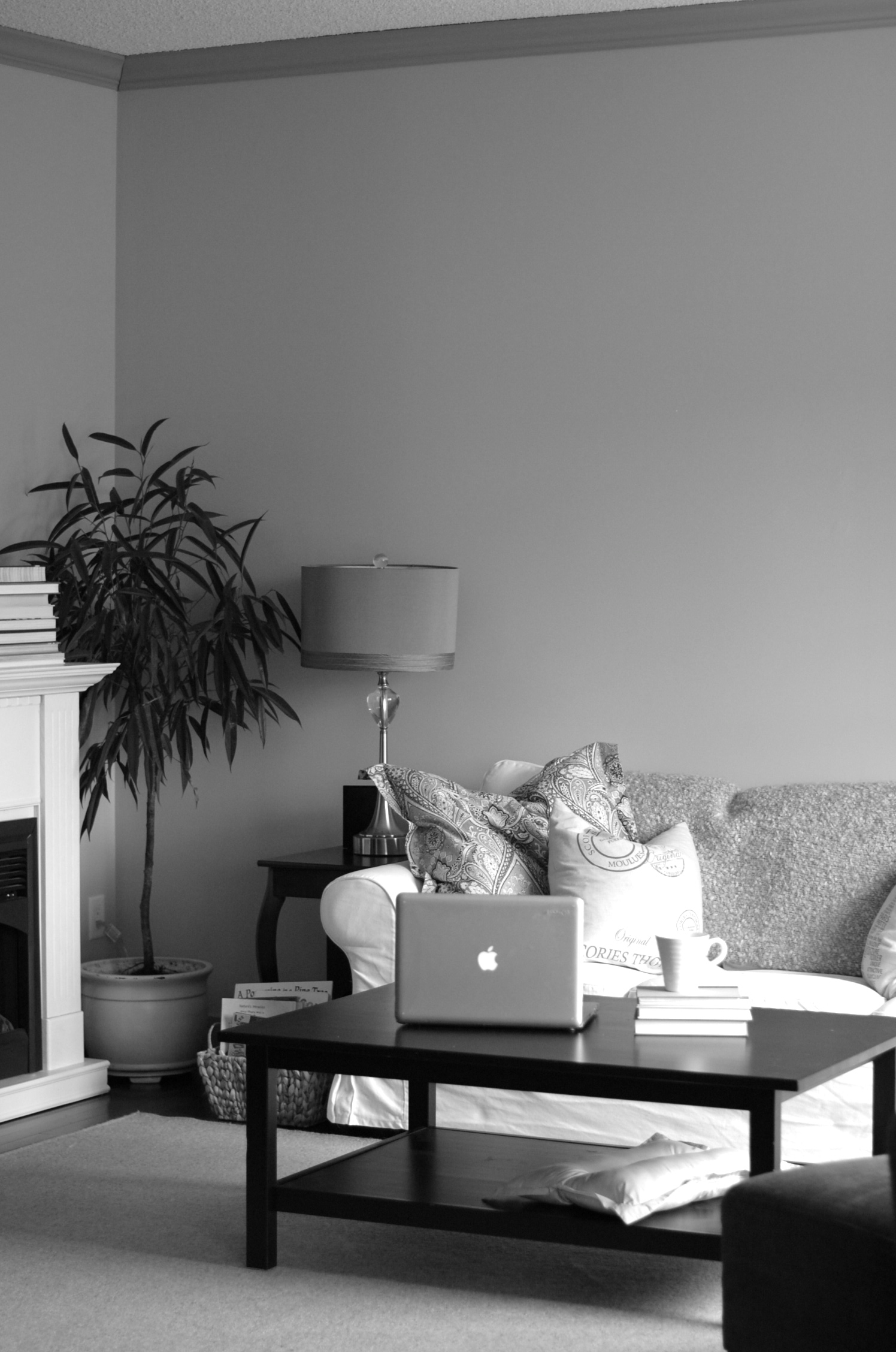
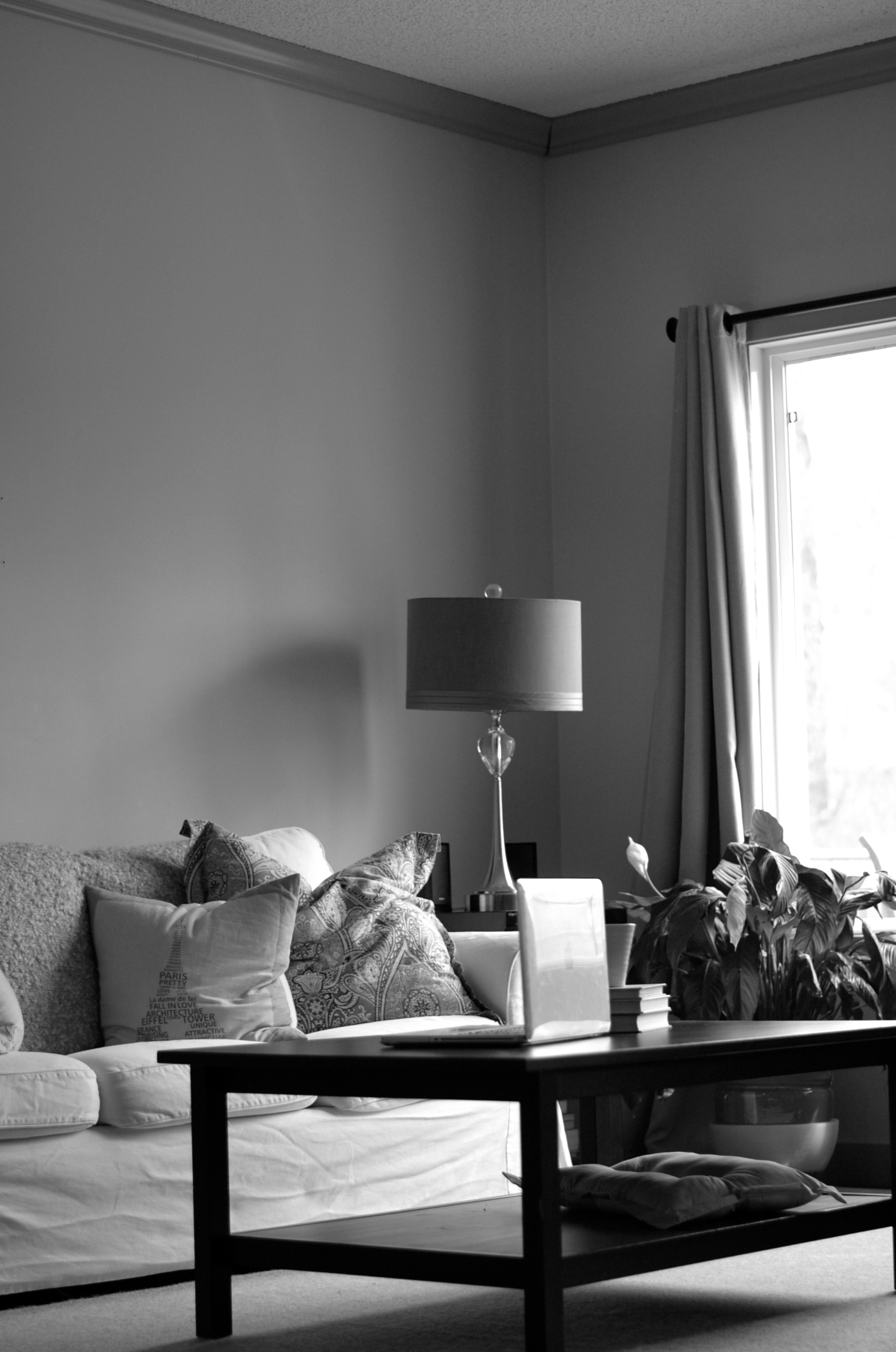
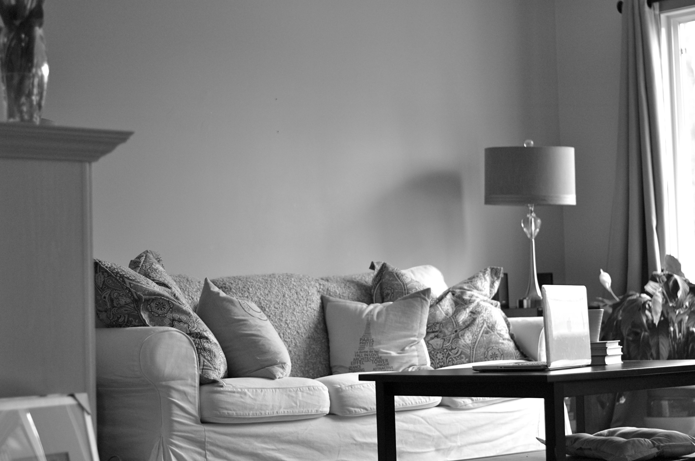
Don’t mind the wrinkly slip cover. I couldn’t be bothered to iron it last time I washed it. Whoops.
Wall hangings are not exactly easy. It takes some serious thought to get the placement just so, and if it’s not exactly what you want, you’re left with holes in the wall. Paper templates on the wall thing works to a degree, but it’s really not the same until you get all your frames up there. See this one below? I would never think to organize my frames this way yet it looks fabulous in this space. Everything is placed at the perfect height so your eyes easily circle the room. Look again…see?
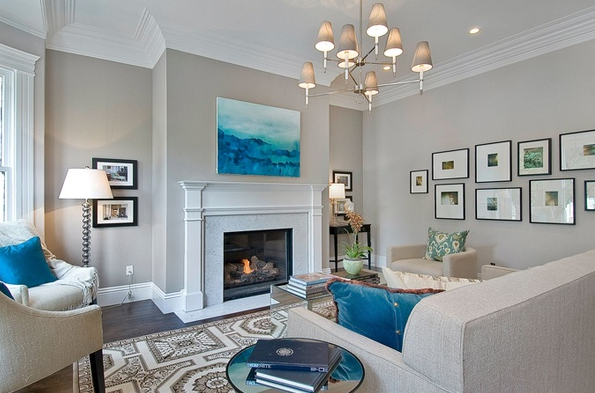
This I LOVE (in theory). I think it could get overwhelming, not to mention the smudges from the little fingers that would be constantly touching it:
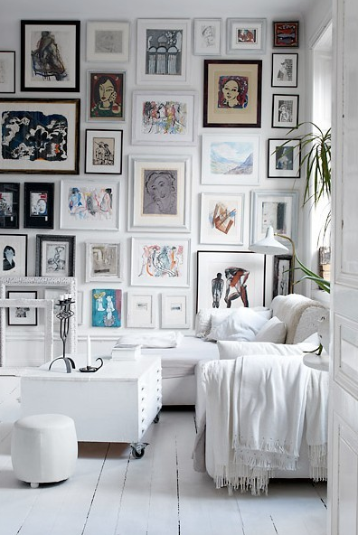
Simple…
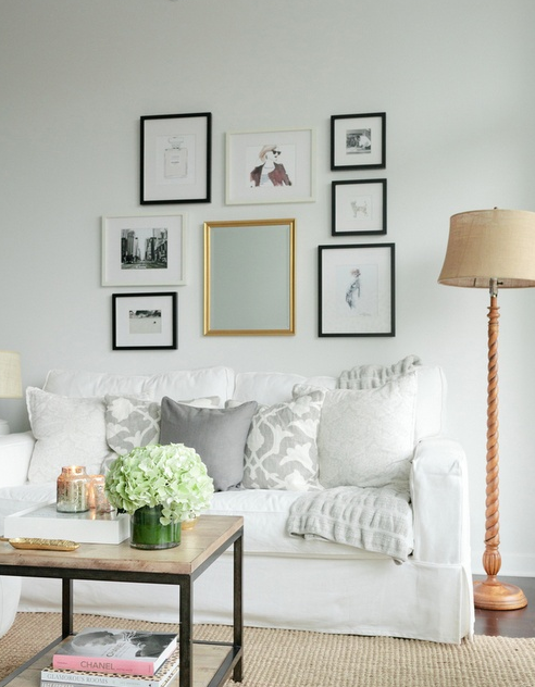
but the neat freak in me says the frames all have to be the same size, color and be neatly organized. Something like this:
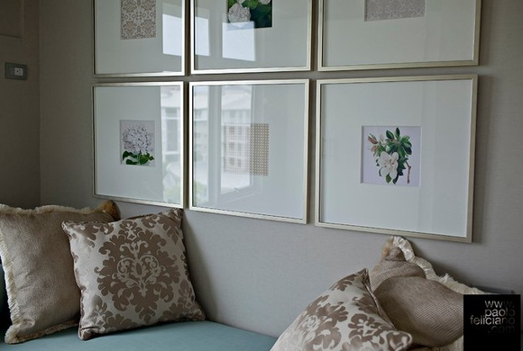
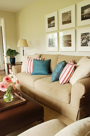
So I ended up going with 14×18 silver and white frames matted to 8×10. I bought the last 5, but need 6 for 2 rows of 3 (or possibly 8 for 2 rows of 4…we’ll see) so I’m waiting for more to come in. I might pop them up in a row of 5 to see how that looks, but I’m thinking with the tall ceilings it might look too empty.
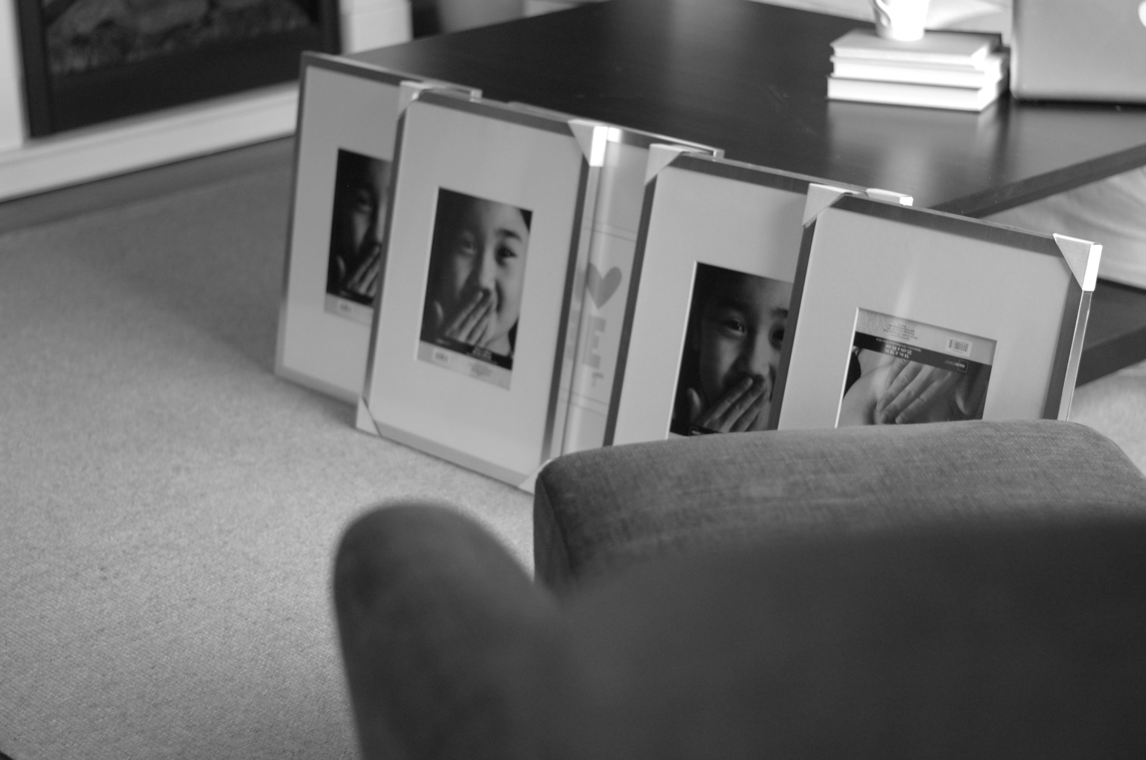
As far as photos in the frames go, I’m thinking I’ll blow up some b&w images from all the places we’ve lived over the years. Have suggestions? I’d love to hear!
Related posts:
Source: http://feedproxy.google.com/~r/naturalMommie/~3/EhphGkN4H1g/


